Utilization Trend by Department
A chart portlet showing the historical license usage information of certain applications in a specified time range grouped by department.
How to configure
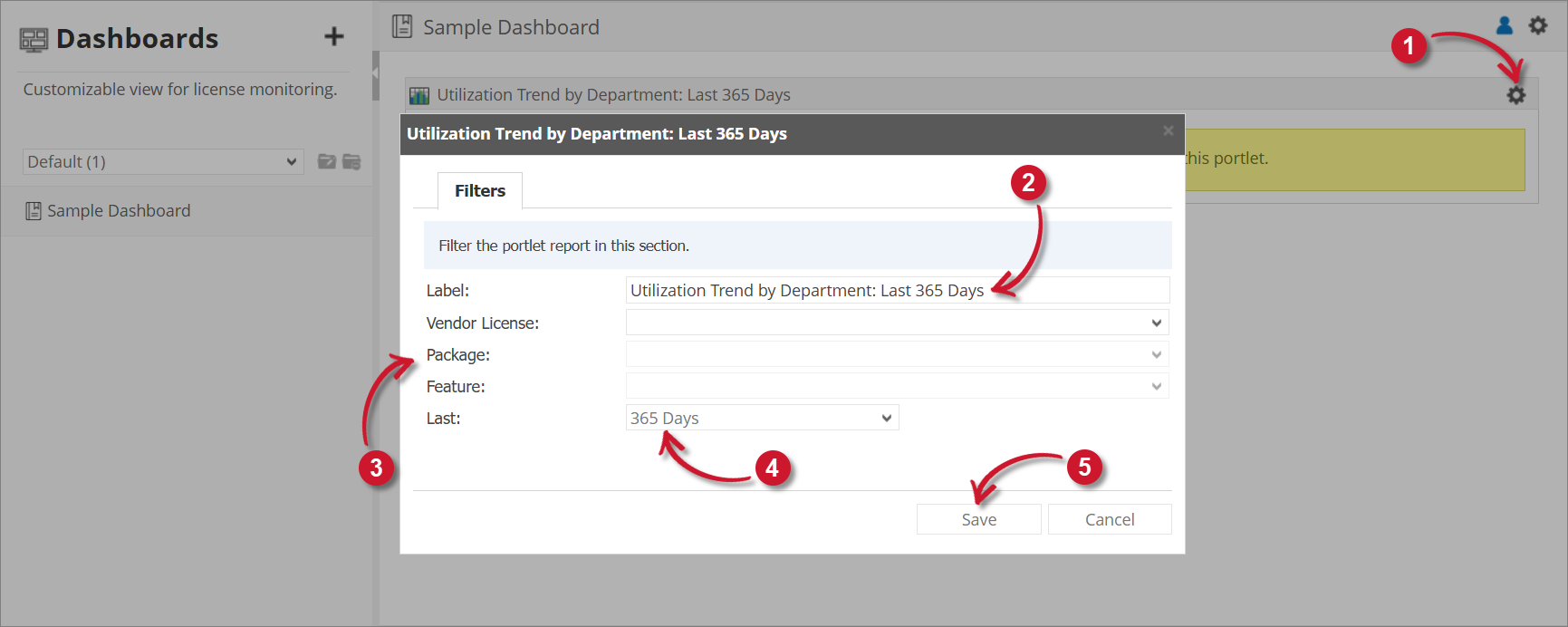
The chart appears blank by default. To display data, you must first configure the chart details. To configure, follow these instructions:
-
Click the gear icon located at the upper-right corner of the portlet or in the portlet.
The configuration dialog should appear.
-
Provide the Label or the text displayed in the title bar of the portlet. The initial value is Utilization Trend by Department: Last 365 Days.
-
Select among the available Vendor License, Package, and Feature.
-
Select among the available time ranges. The default is 365 days.
-
Click Save to continue or Cancel to disregard.
The chart should be displayed based on the configuration selected.
The chart contains Max In Use and User Department.
 Utilization Trend by Department Configuration
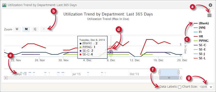
Chart Functionalities
The portlet contains some functionalities to manipulate the display. Use these descriptions to use these functionalities.
a. Export - choose among the available formats to export the chart.
b. Zoom - choose among the available time chunks to manipulate the displayed data.
- W - Weekly
- M - Monthly
- Q - Quarterly
- Y - Yearly
c. Legend - click the legend to hide or show.
d. Data Information - hover each point in the chart to show the data information.
e. Navigator - slide the navigator to specific date ranges to manipulate the displayed data.
f. Data Labels - tick the option to show data labels in the chart.
g. Chart Size - choose among the available sizes to resize the chart.