# Machine Level Dashboard

The Machine Level Dashboard provides a comprehensive overview of machine-level usage details. This dashboard helps users analyze and track the usage patterns of different machines within the Bentley Cloud Environment.

Machine Level Dashboard: Dashboard Components

Machine Level Dashboard: Dashboard Components

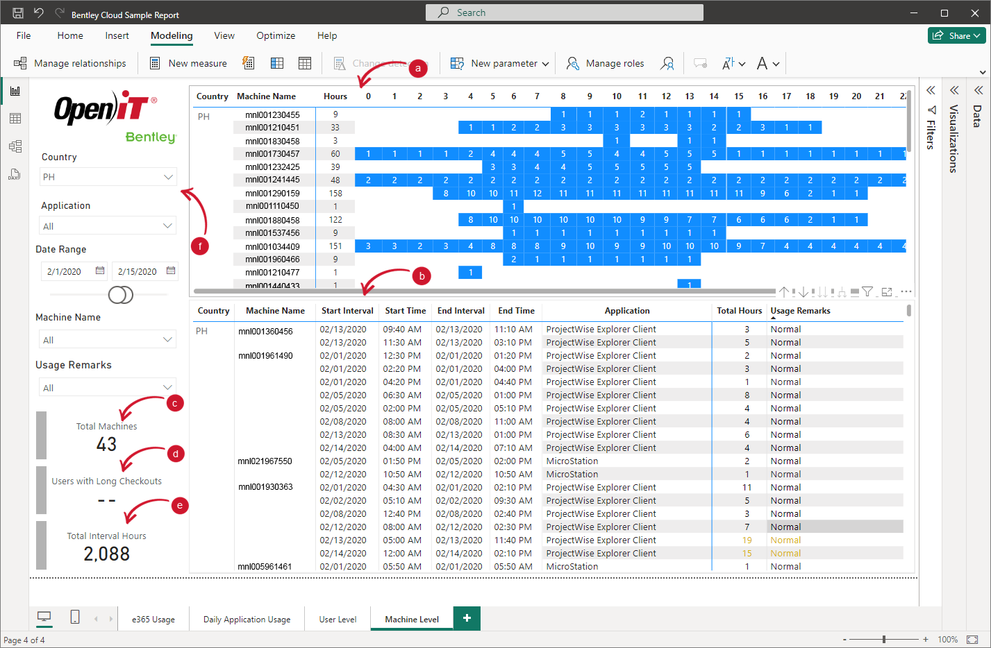
This dashboard is composed of the following:

  1. Machine Usage Heat Map
    This displays the usage hours of various machines throughout the day. Each row represents a machine, and each column represents an hour of the day. This heatmap is used to visualize the distribution of machine usage across different times of the day to determine peak usage hours.

  2. Machine Usage Table
    This table presents information about machine usage. This table has the following data:

Data Description Example
Country The country where the machine is located. PH (Philippines), AU (Australia)
Machine Name The name of the machine being tracked. mnl001360456, mnl001961490
Start Interval The date when the usage interval started. 02/13/2020, 02/01/2020
Start Time The time when the usage interval started. 09:40 AM, 11:30 AM
End Interval The date when the usage interval ended. 02/01/2020, 02/14/2020
End Time The time when the usage interval ended. 05:50 PM, 11:40 PM
Application The application used during the interval. MicroStation, ProjectWise Explorer Client
Total Hours The total number of hours the machine was used during the interval. 3, 19
Usage Remarks Additional remarks or notes about the usage.
  • Normal indicates that the machine's usage duration does not exceed in 24 hours.
  • Camping indicates that the machine's usage duration exceed in 24 hours. This remark displays the day and minutes of the machine usage.
Normal, Camping 1 day 20 minutes
  1. Total Machines
    This displays the total number of machines being monitored.

  2. Users with Long Checkouts
    This shows the number of users with long checkout times. This helps the user to identify potential issues with users utilizing the license longer than necessary.

  3. Total Interval Hours
    Indicates the total number of hours across all usage intervals for all machines.

  4. Filter Panel
    This enables users to customize the dashboard view according to specific criteria.

User can visualize the dashboard data through the following criteria:

Criteria Description Example
Country Filters data based on the country where the machines are located. AU (Australia), PH (Philippines)
Application Name Filters data based on the application used. ADINA Ultimate, Bentley Navigator
Date Range Assists user in specifying the date range to filter the usage data 5/30/2020 - 8/19/2020
Machine Name Filters data for specific machines. mnl001360456, mnl001961490
Usage Remarks Filters data based on usage remarks. Normal, Camping 1 day 20 minutes

# Next Steps?

For your organization to efficiently visualize your Bentley Cloud data using Power BI'S intuitive interface, you can proceed with configuring Power BI Gateway:

    Configuring Power BI Gateway

We value your feedback!

Please take a few minutes to complete our survey and share your thoughts on your recent experience with our documentation.

Take survey

Close